A Hold To Confirm Button widget for Flutter apps
HoldToConfirmButton
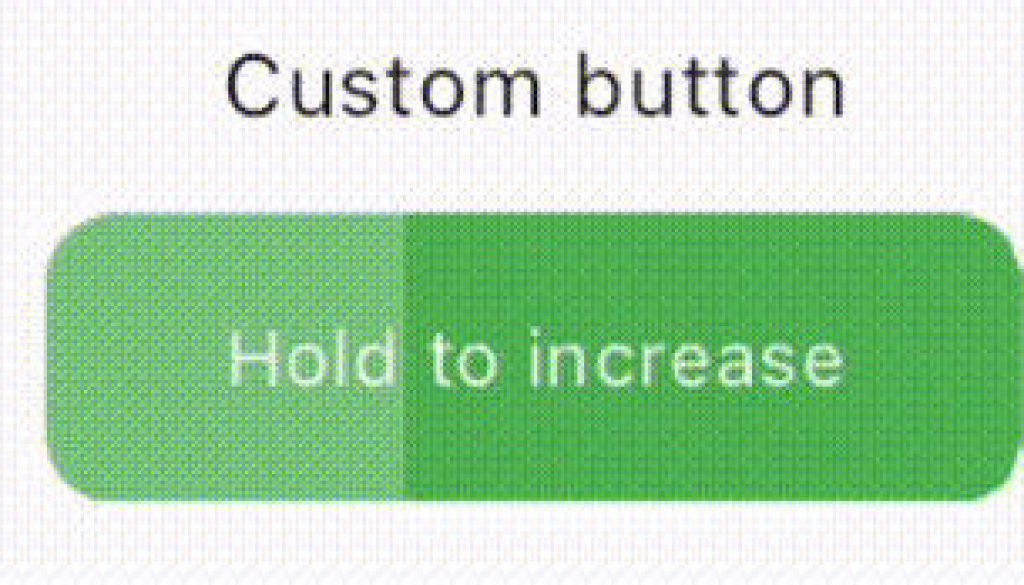
This package provides a HoldToConfirmButton widget for Flutter apps. It allows users to hold down the button, which visually fills up as it’s pressed. Upon complete fill, a designated action is triggered.
Installation
Add the hold_to_confirm_button package as a dependency in your pubspec.yaml file:
dependencies:
  hold_to_confirm_button: ^latest_version # Replace with the latest version available on pub.dev
Import the package in your Flutter project:
import 'package:hold_to_confirm_button/hold_to_confirm_button.dart';
Usage
Default values:
HoldToConfirmButton(
  onProgressCompleted: () {
    // Handle the completed progress here
  },
  child: const Text('Hold to increase',
    style: TextStyle(color: Colors.white),
  ),
)
Custom values:
HoldToConfirmButton(
  onProgressCompleted: () {
    // Handle the completed progress here
  },
  child: const Text('Hold to increase'
    style: TextStyle(color: Colors.white),
  ),
  hapticFeedback: false,
  backgroundColor: Colors.green,
  borderRadius: BorderRadius.all(
    Radius.circular(12),
  ),
)
Customization
The HoldToConfirmButton widget offers various customization options to match your app’s design:
child: The widget displayed within the button area (e.g., Text, Icon).hapticFeedback: Enables or disables haptic feedback on button press (defaults to true).backgroundColor: Sets the background color of the button.borderRadius: Defines the border radius of the button.
Support
Like this project? Leave a ⭐️, it’s free and means a lot.
Consider supporting its upkeep with a coffee. Your generosity is appreciated! ☕
Contributions
Contributions, issues, and feature requests are welcome! Feel free to check issues page.
License
This project is MIT licensed.


